The Challenge
Preneur is a dynamic marketing and communications agency dedicated to empowering small and medium-sized enterprises (SMEs) and entrepreneurs. Our task was to craft an identity for Preneur that balanced friendliness with professionalism. This challenge required a strategic blend of approachable design and expert communication to effectively support small and medium-sized enterprises and entrepreneurs.
How we solved it
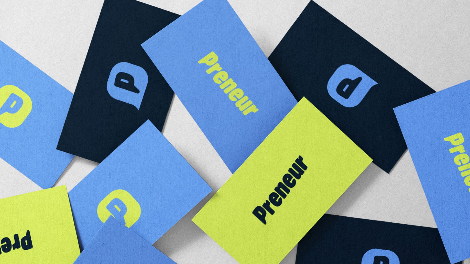
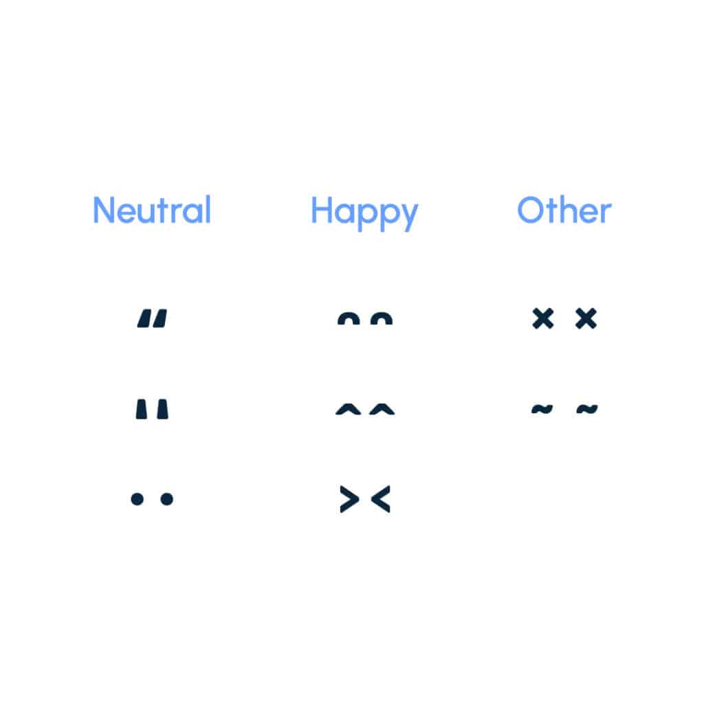
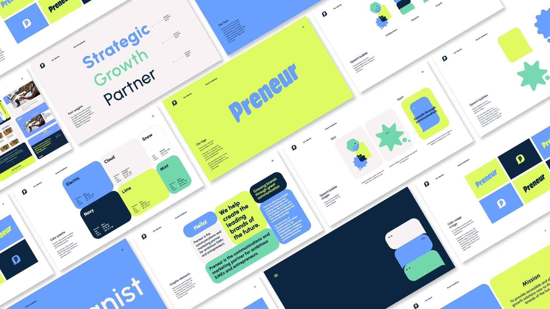
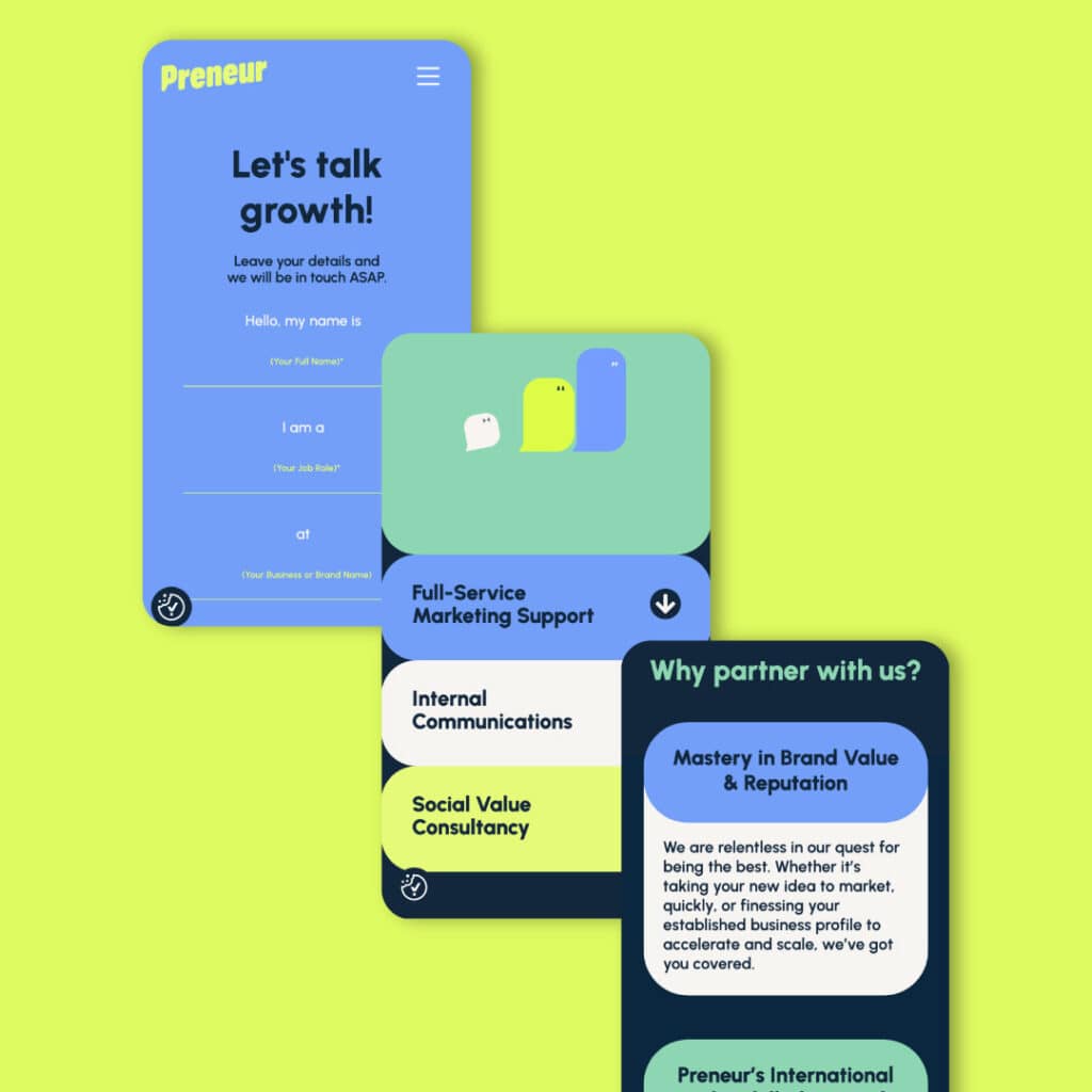
We tackled this by deeply engaging with Preneur’s vision. Our brand positioning development process helped to crystallise Preneur’s identity. We utilised a mix of inviting colours and clear, professional typography, alongside diverse speech bubbles, to visually communicate Preneur’s wide array of services. This approach not only resonated with their target audience but also authentically represented Preneur’s unique character.